Project Goal
To reinforce the brand's leading position in the premium chocolate segment, to make the consumer feel the luxury perception of the product through packaging, and to ensure it becomes the first choice in gifting culture.
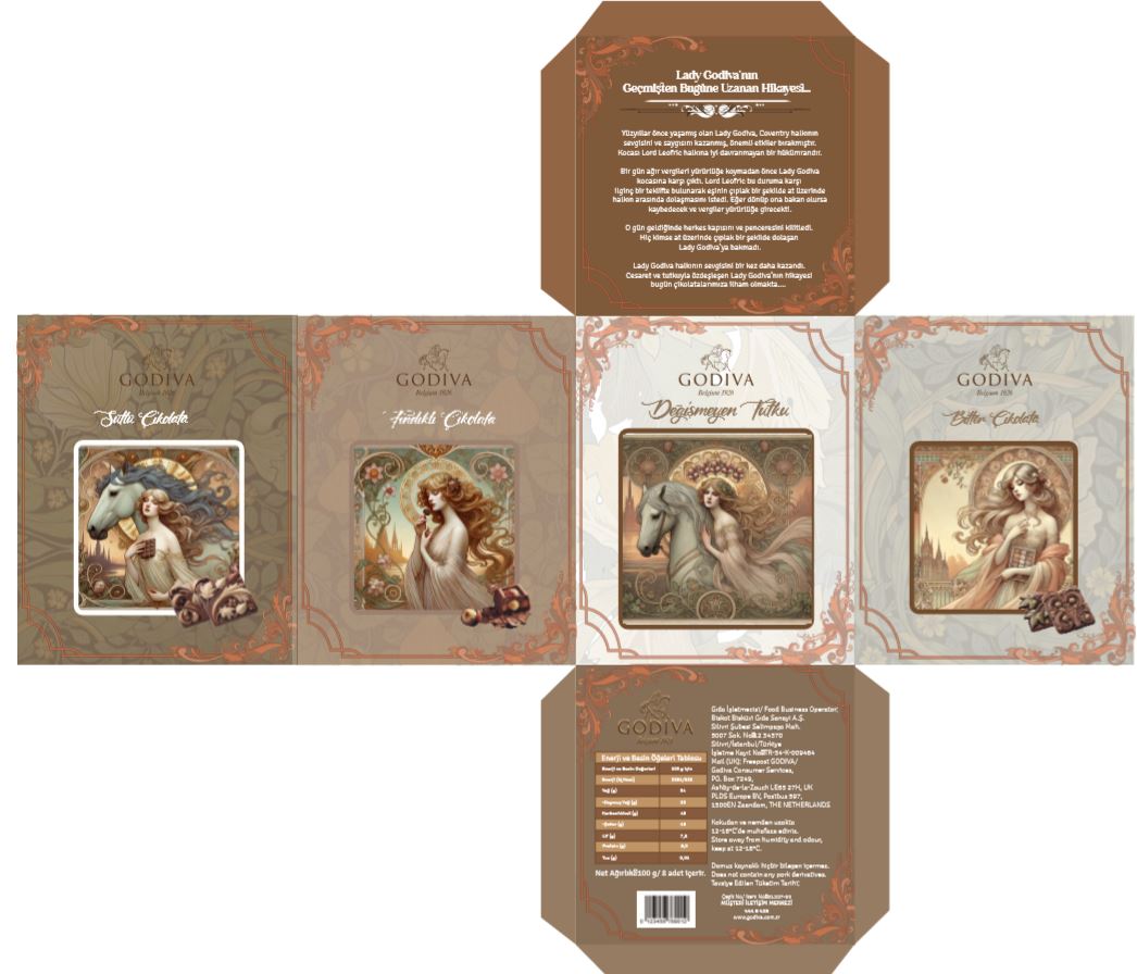
Luxury Design Language
We visualized the brand's "perfect chocolate" promise with the elegance of gold foil, the depth of dark brown tones, and the nobility of minimal typography. We used special paper and printing techniques to enhance the tactile experience.
Design Elements
- Gold foil logo and detail applications
- Emboss printing techniques
- Selection of premium textured paper
- Sophisticated color palette (Gold & Dark Chocolate)
- Elegant box shape suitable for the gift concept
- Use of elegant and readable serif fonts
Achievements
- Premium Positioning: Luxury consumption perception was strengthened
- Sensory Experience: A sense of quality was created in the consumer through the texture of the packaging
- Brand Heritage: The brand's deep-rooted history was presented with a modern language